
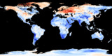
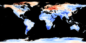
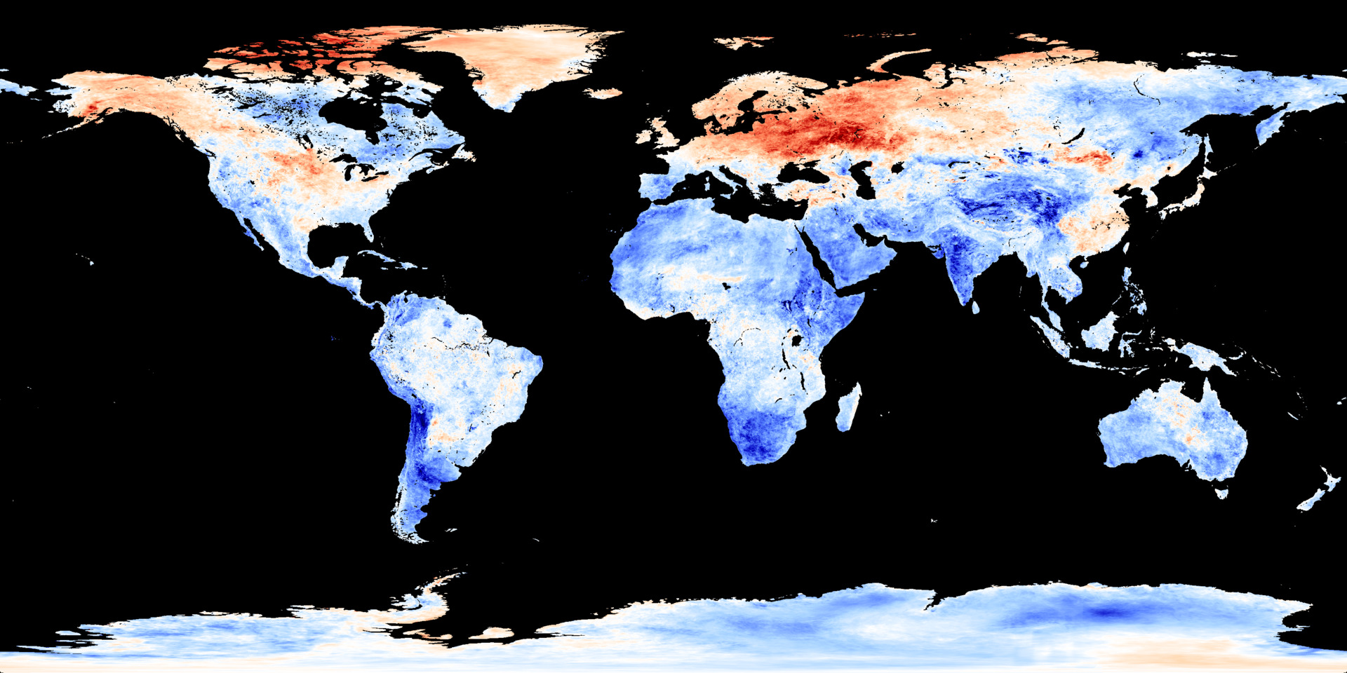
Earth Surface Temperature Anomaly
 Image
ImageRes:
Image:
Low Res Med Res Hi Res 4KSource: NASA Earth Observations
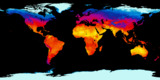
This map shows the temperature difference between the current montly average and the average from the same month between 2001 and 2010. This reveals the areas that are colder or warmer than the average around the start of the century.
Note that an individual snapshot like this should not be used as evidence in any debate about climate. The differences from average that you see here are mostly due to seasonal conditions, e.g. an abnormally warm or cool season. These snapshots are pieces in a larger puzzle. To understand climate change we need to analyse these data snapshots over many years.
Data for this map comes from NASA's Terra satellite. You can see where this satellite is right now on the Terra orbit tracking page.
Data source: neo.sci.gsfc.nasa.gov
Related Feeds
More Earth Feeds


Feed Properties
ID: EaSTA_SurfaceTempAnomaly
Type: Image
Updates: Daily
Resources:
Image/Data Usage:
NASA's NEO images are freely available for public use without further permission as long as credit is given. See neo.gsfc.nasa.gov/about/
